The Visual Identity for the Parametrica Furniture Factory
What were we doing: Branding
What a difficulty: High
2024
Content:
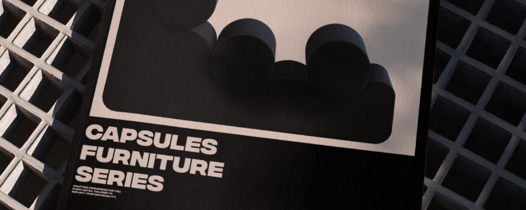
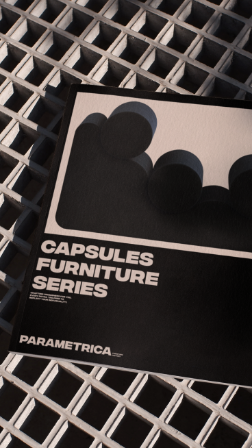
Our creative efforts have materialized in a unique identity for the PARAMETRICA brand. Our recent work embodies the aesthetics of minimalism, imparting refinement and style to each design element. The primary colors of our identity are black, symbolizing elegance and strength, as well as Starlight, imparting gentleness and individuality.
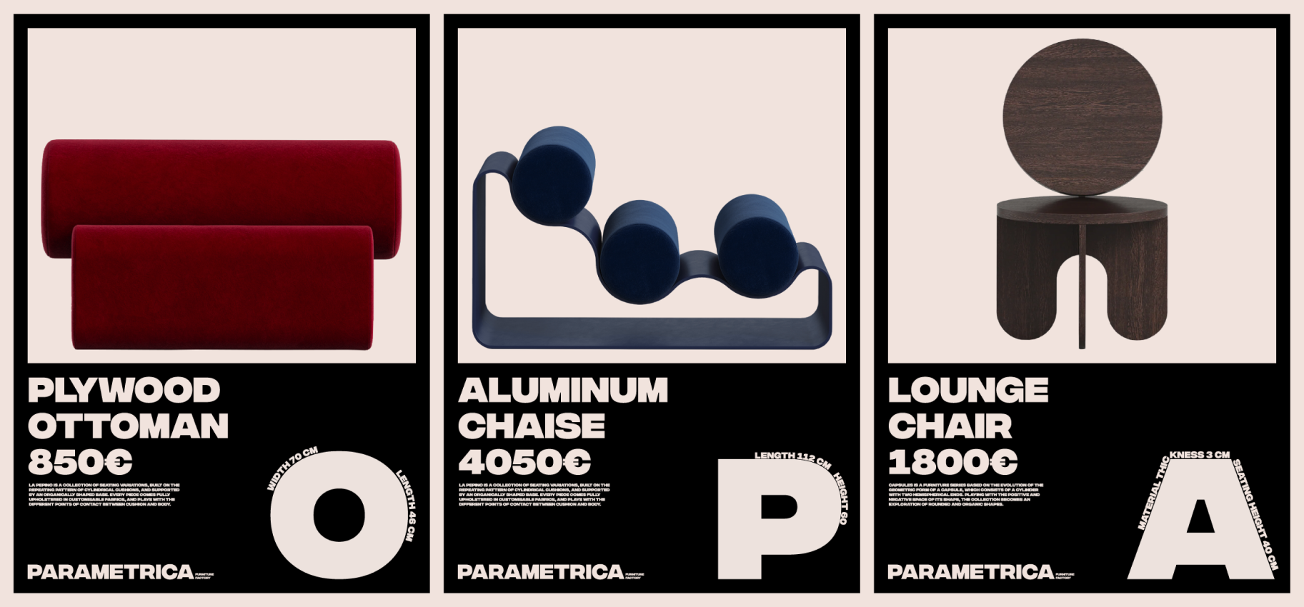
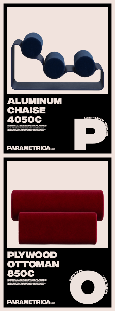
Large letters with small details create a distinctive visual impression, emphasizing attention to detail and thoroughness at every stage of the process.


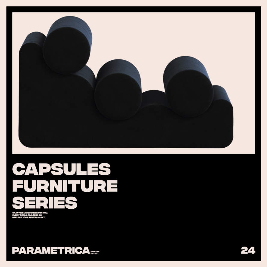
Each product produced by PARAMETRICA undergoes a meticulous handmade process in their workshop.
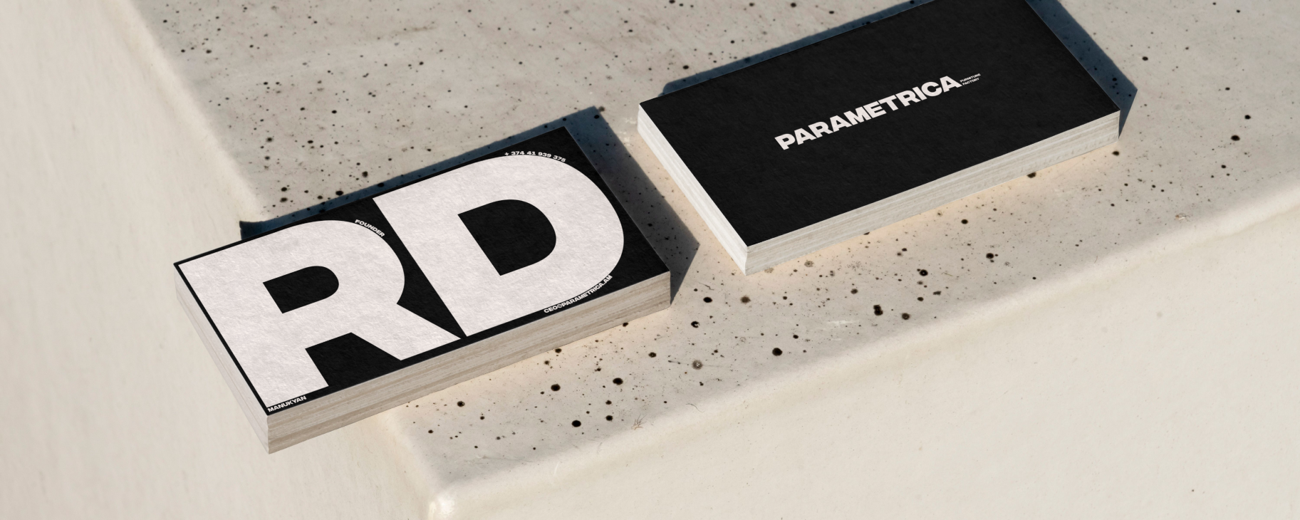
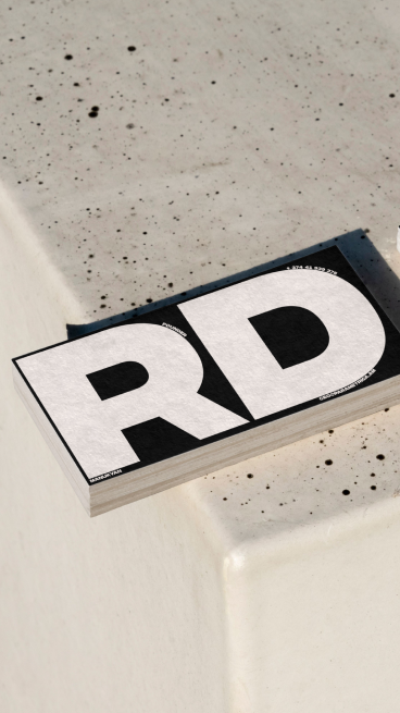
Utilizing exclusively high-quality materials from local suppliers, they aim for a conscious and sustainable approach. Their philosophy revolves around creating products that not only withstand the test of time but also embody aesthetics and quality.
You might also like
See all
