Unveiling WeldLend's Powerful New Visual Identity: Where Skyscrapers and Tools Converge
What were we doing: Branding
What a difficulty: High
2023
Content:
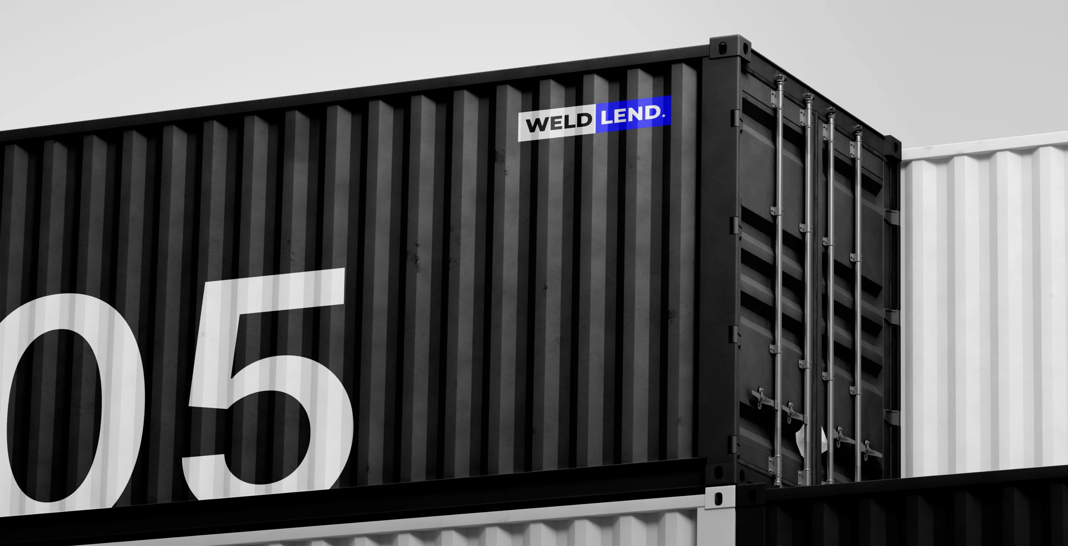
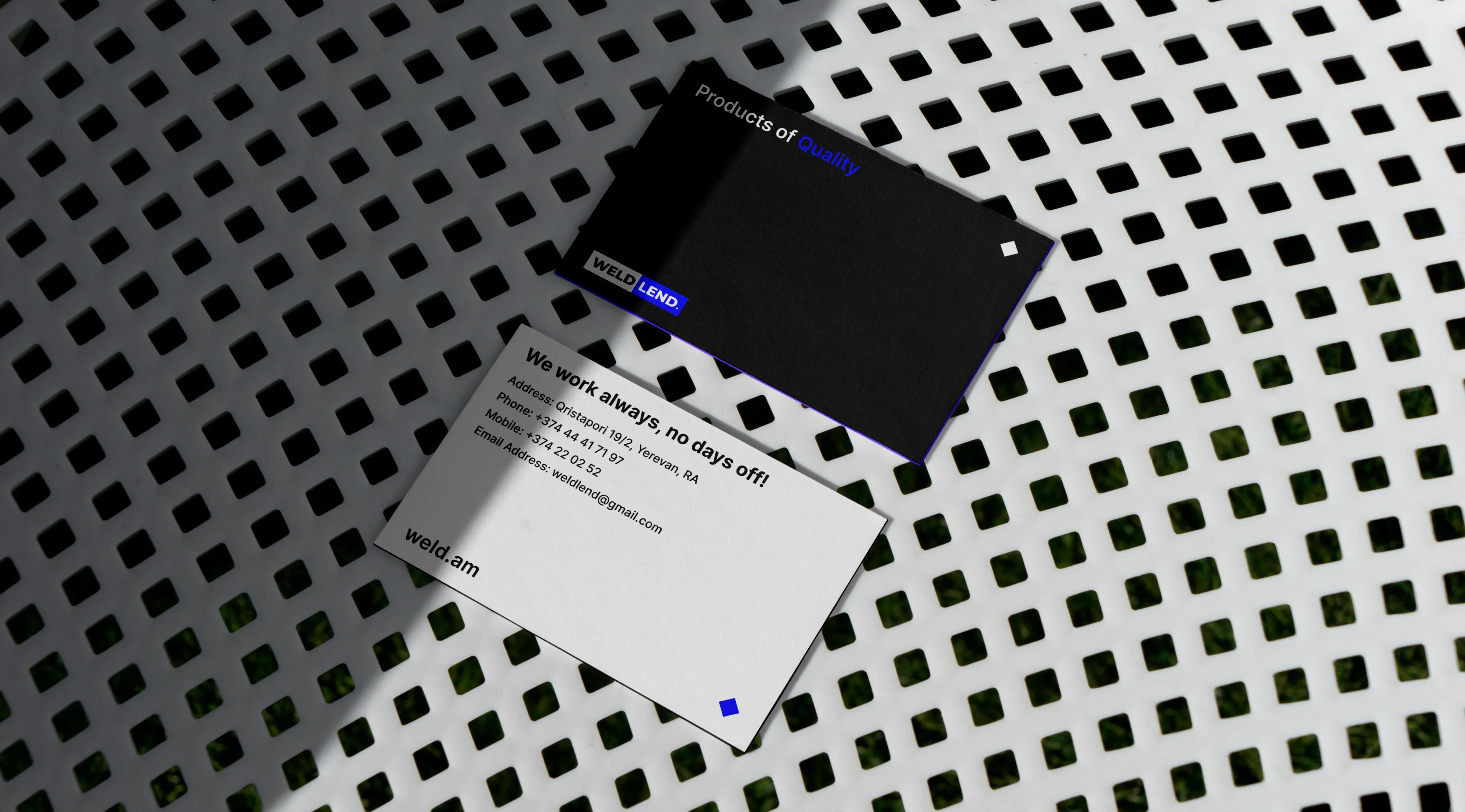
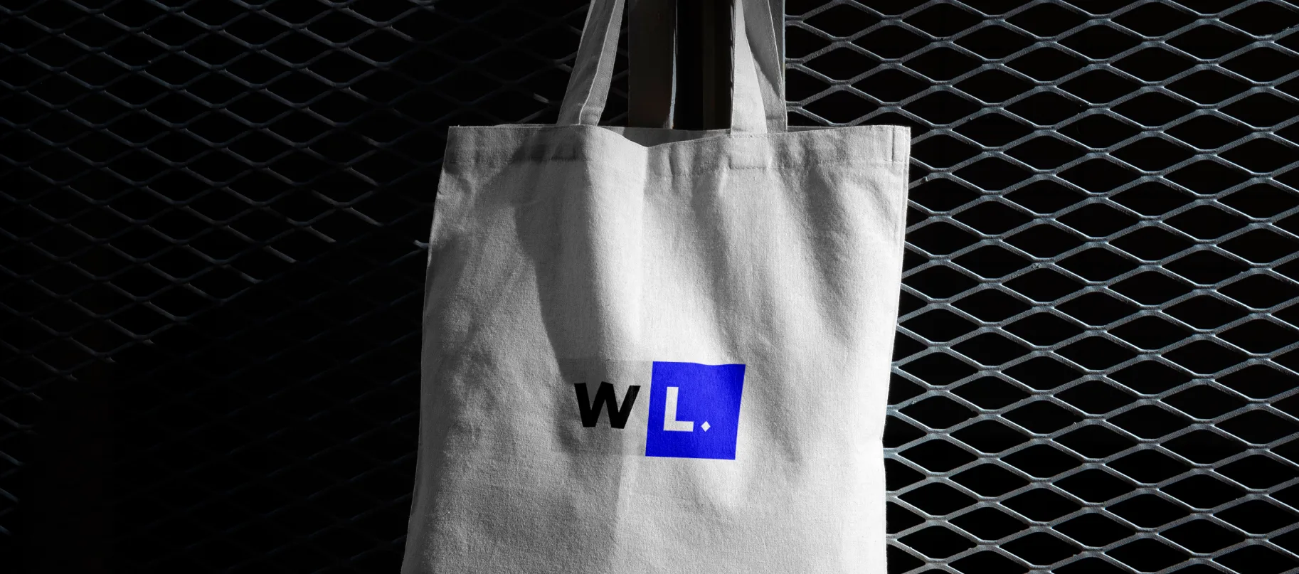
A harmonious color palette, thoughtfully composed of deep blues, timeless black, and sleek gray, was chosen with care. These shades don't just convey professionalism; they emanate trustworthiness, consistency, and a commitment to top-tier quality. Every element, from the logo to the packaging, from the store ambiance to advertising materials, is steeped in this cohesive design language.
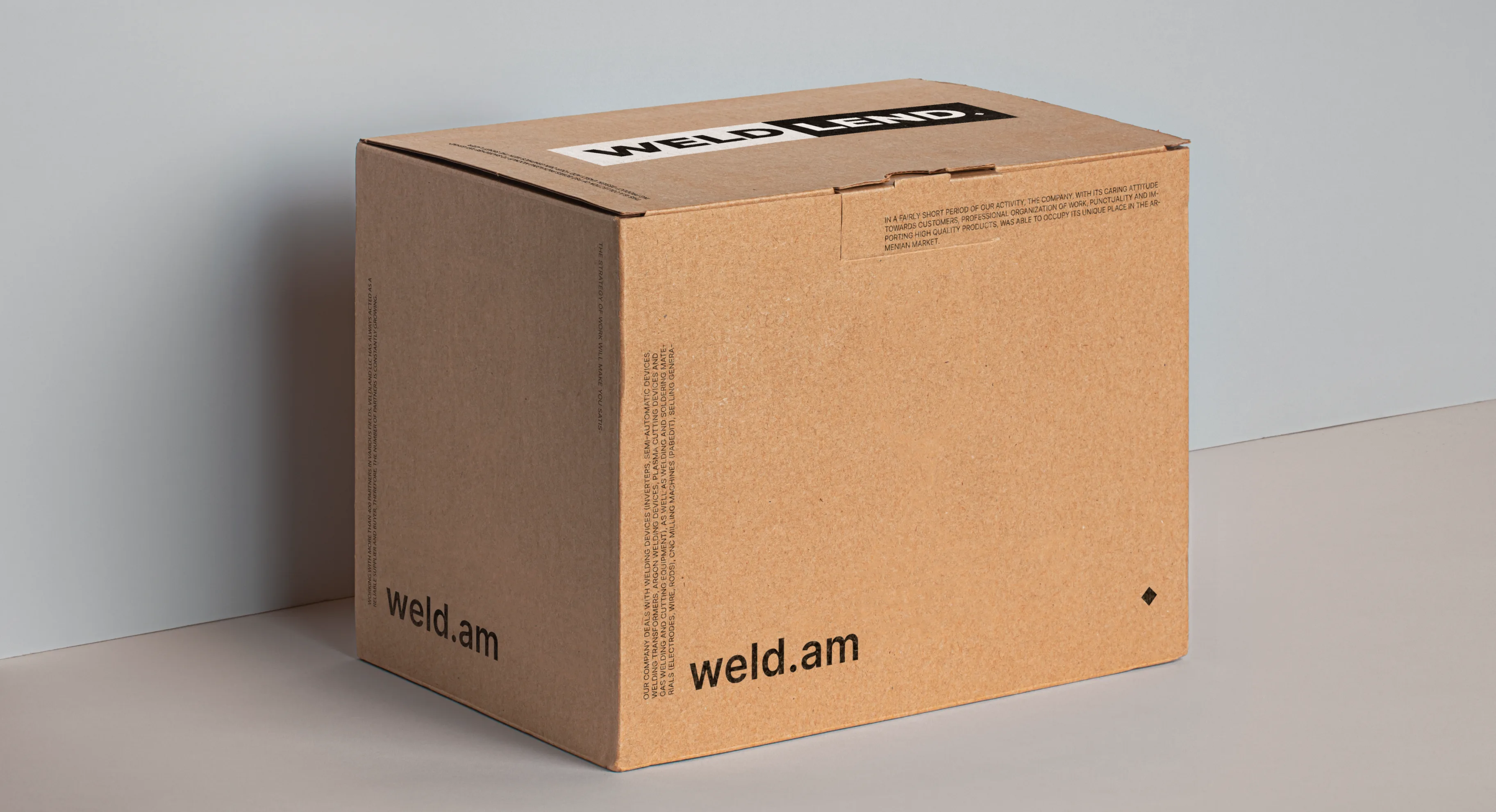
The reimagined visual identity mirrors and amplifies WeldLend's core values and mission. It is an emblematic embodiment of the company's dedication to offering a reliable partnership to its customers in the expansive universe of construction tools. With this new identity, WeldLend isn't merely selling tools; it's building connections and fostering relationships founded on dependability and shared aspirations.
The journey to this new identity was a labor of passion for our team. Every stroke of the logo's design, every hue selected for the palette, and every detail of its application to various touchpoints was executed with precision. We take immense pride in contributing to this transformative project, aligning visual aesthetics with WeldLend's strategic goals.
In summary, WeldLend's revamped visual identity is a beacon, radiating the ethos of innovation, dependability, and growth. It symbolizes not just tools and skyscrapers, but the foundation of a lasting alliance with those who entrust their construction aspirations to WeldLend.
You might also like
See all