The Visual Identity for the Event Organization Company Episode
What were we doing: Branding
What a difficulty: High
2024
Content:
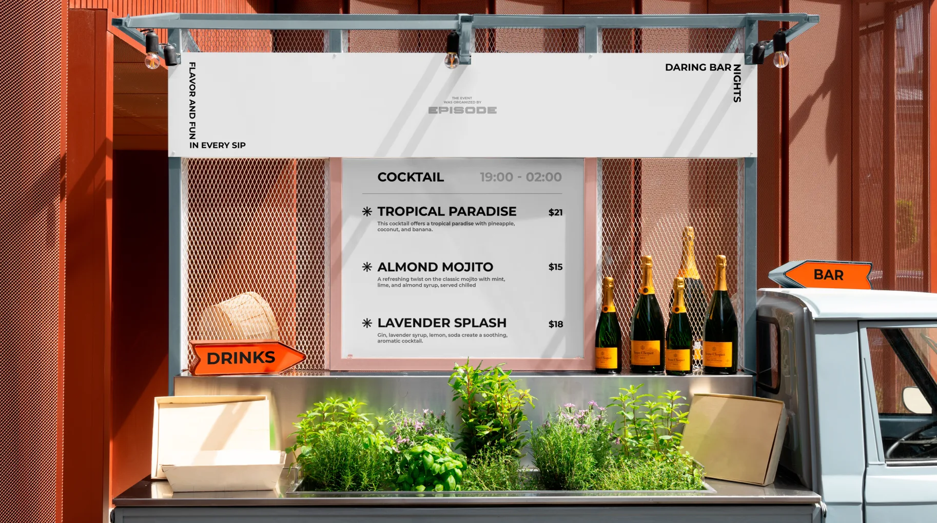

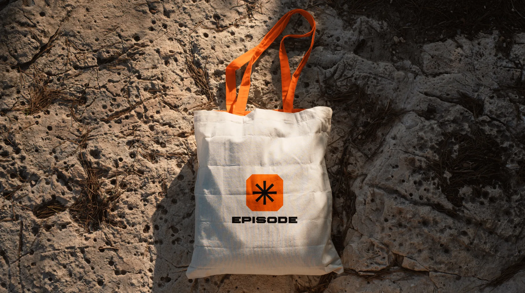
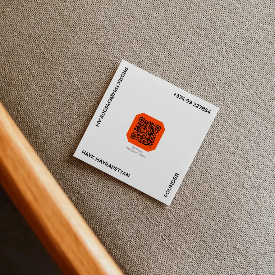
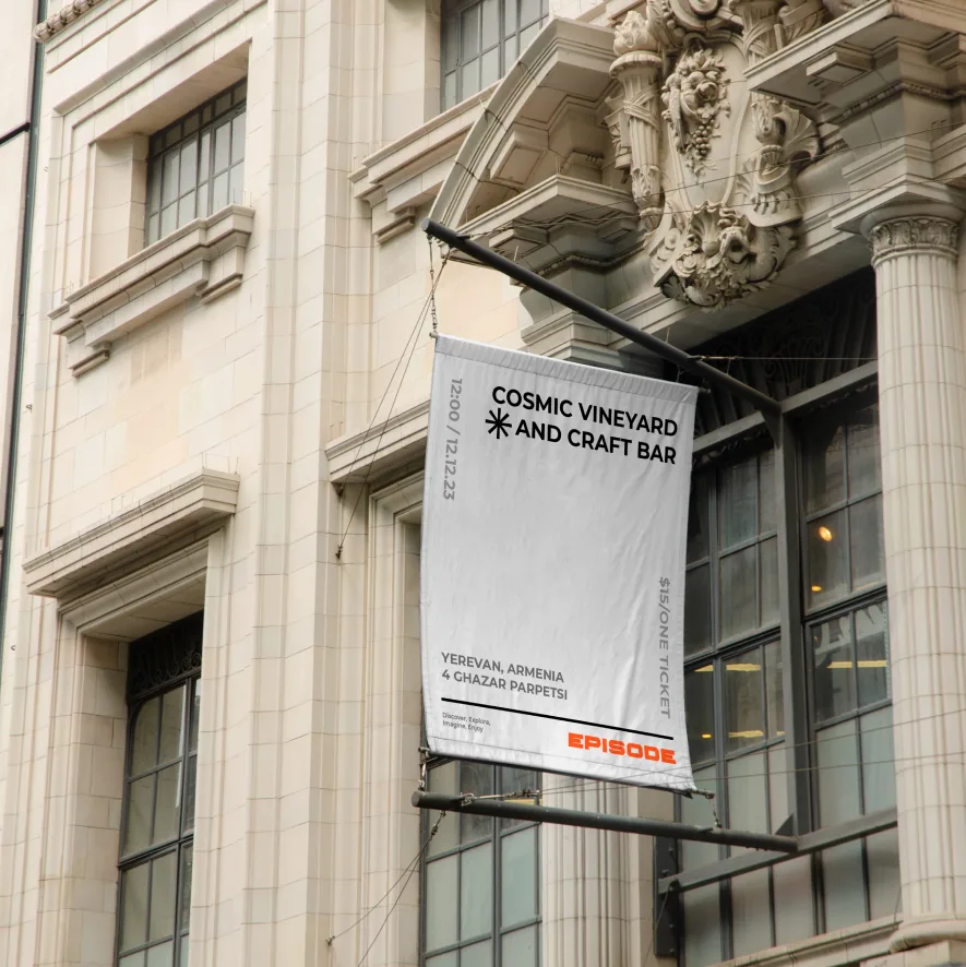
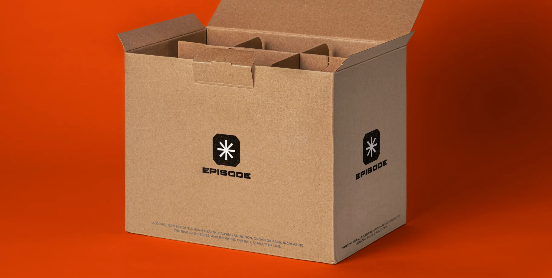
At the heart of this branding effort is our meticulously designed EPISODE logo, a symbol that encapsulates our unwavering passion for creating those extraordinary experiences and events that linger in memory. This logo is more than a mark; it's an invitation to immerse yourself in the world of orange inspiration.
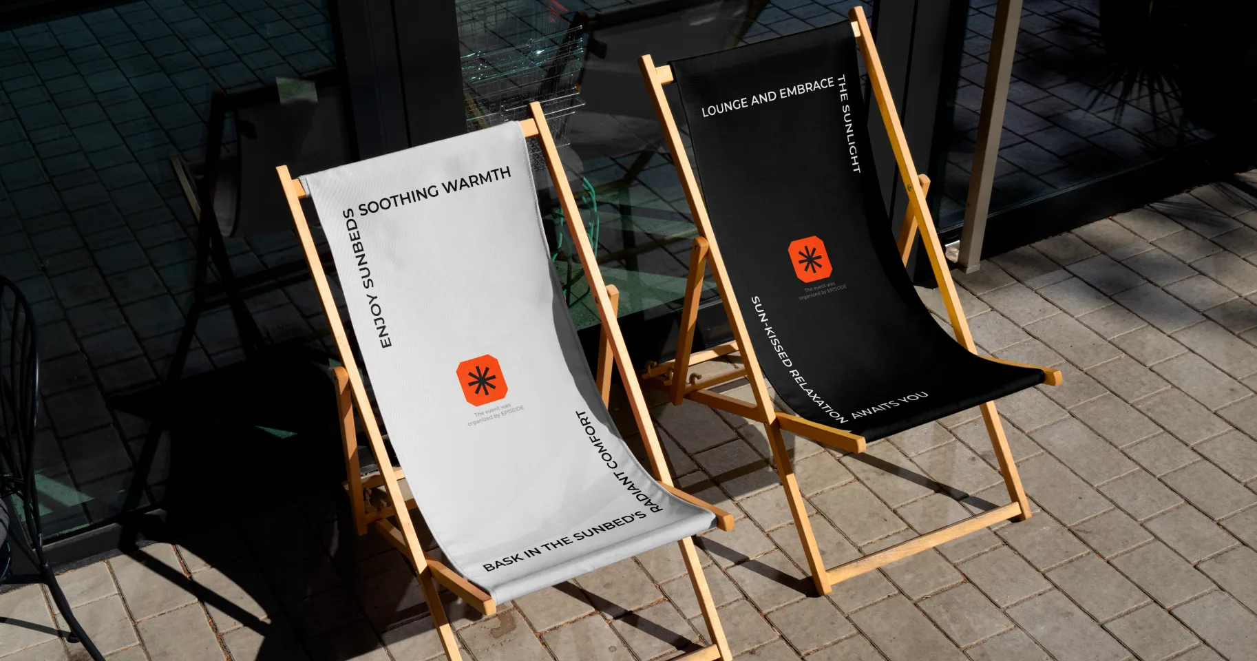
Our comprehensive branding approach extends beyond the logo. We've carefully curated a palette of colors, typography, and graphic elements that harmoniously come together, creating a unified style that underlines the exceptional character of the EPISODE brand.
Our journey in developing the EPISODE brand encompassed a deep understanding of the target audience, thorough competitor research, and the formulation of a strategic roadmap. This roadmap ensures that EPISODE not only stands out in the market but also seamlessly caters to the needs and expectations of our clients.
As we proudly unveil this new EPISODE design, we have unwavering confidence that it will not only solidify the brand's position in the market but also inspire our clients to view EPISODE as their trusted partner in the world of event organization.
We are honored to have played a role in this project and are committed to supporting its growth. Our dedicated team eagerly anticipates the opportunities and challenges that lie ahead, and we look forward to witnessing the continued success of EPISODE as it becomes synonymous with extraordinary moments and events.
You might also like
See all