Crite-branding for golden jewelry
(Scroll)
Scroll to Explore
What were we doing: Branding
What a difficulty: High
2021
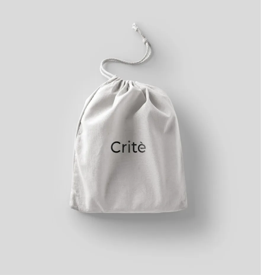
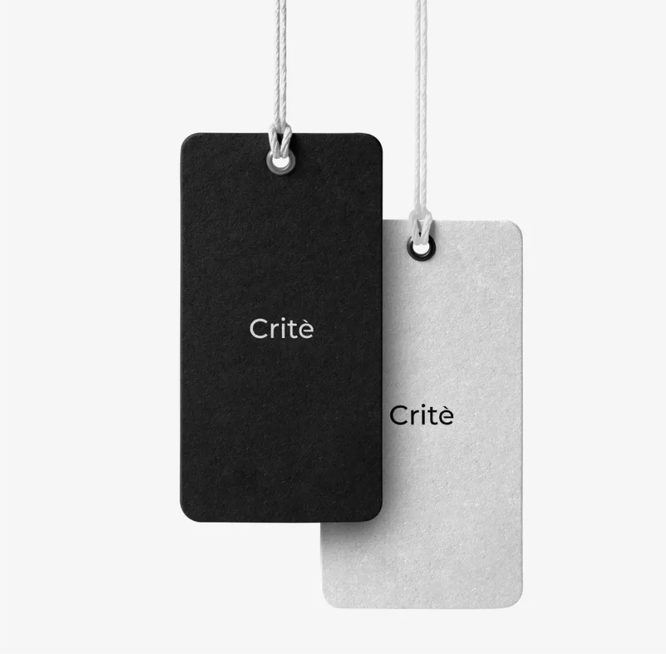
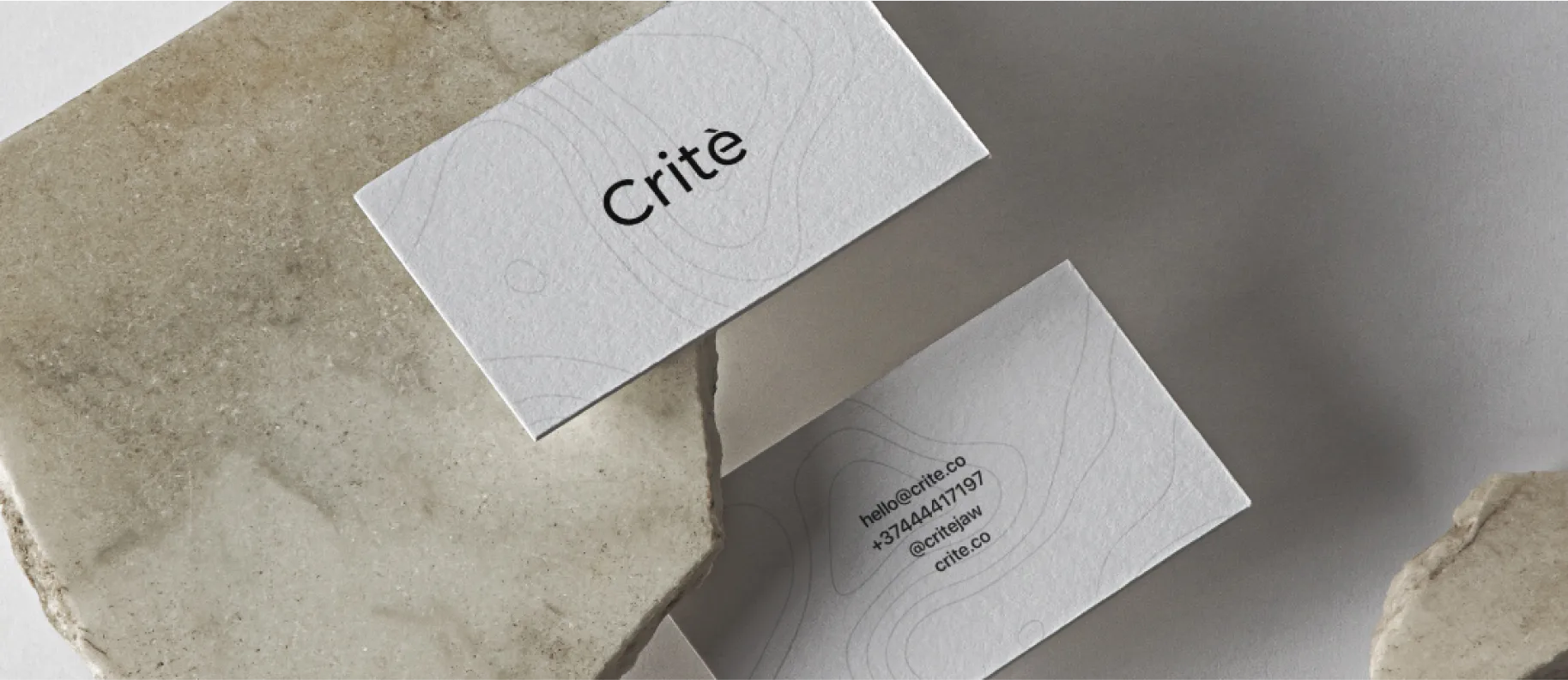
Here is a new voice in the world of golden jewelry-Crite. Our initial goal was to create a brand that looks plain and yet bold, calming and yet intriguing, serene and yet fascinating. Simplicity and confidence best describe this design. It is crafted with classical combination of thick black on a plain white background. The minimalistic logo in black illustrates the lucidity of the brand and the white background with the fine linear elements creates serenity and easiness for eyes.
Content:
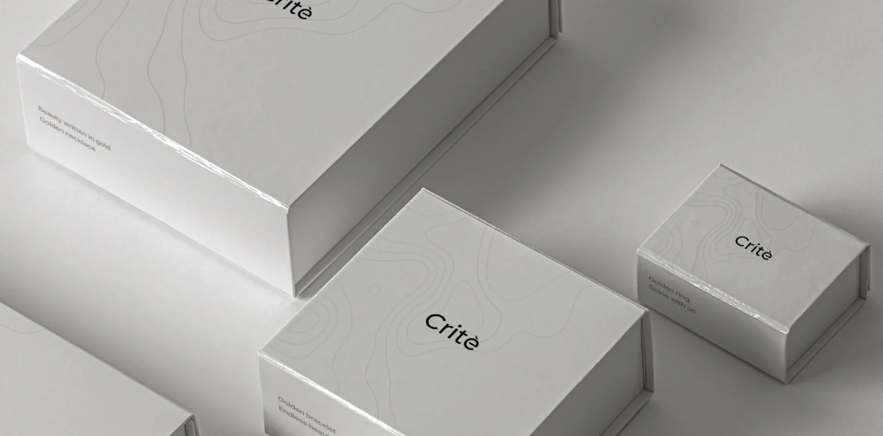
The whole packaging is one complete story. There is nothing to take away from this design and nothing to add. Just enjoy it.
The whole packaging is one complete story. There is nothing to take away from this design and nothing to add. Just enjoy it.
"Crite" Project has been featured by World famous packaging design blogs: Packaging of the World and World Brand Design Society.
You might also like
See all